Wednesday, December 14, 2011

BREAKTHROUGH


This was the final drawing I did in this class, so I wanted to make it special. I decided to paint with watercolor, and I like how it came out. I tried to create light with bright orange, dark with blue, and use the tones in between for shading. The most difficult thing, besides getting the color I wanted out of the paint, was getting colors to blend. Unfortunately, you can still see clear lines where colors end and others begin, which doesn't look too bad, but it wasn't intentional. In fact, this painting mostly thrives on dumb luck. Looking at it now, I see a ton of great parts that make the painting great, but I know I didn't do them. Or at least, I didn't plan to. Still, I think of this painting as a breakthrough for me. 
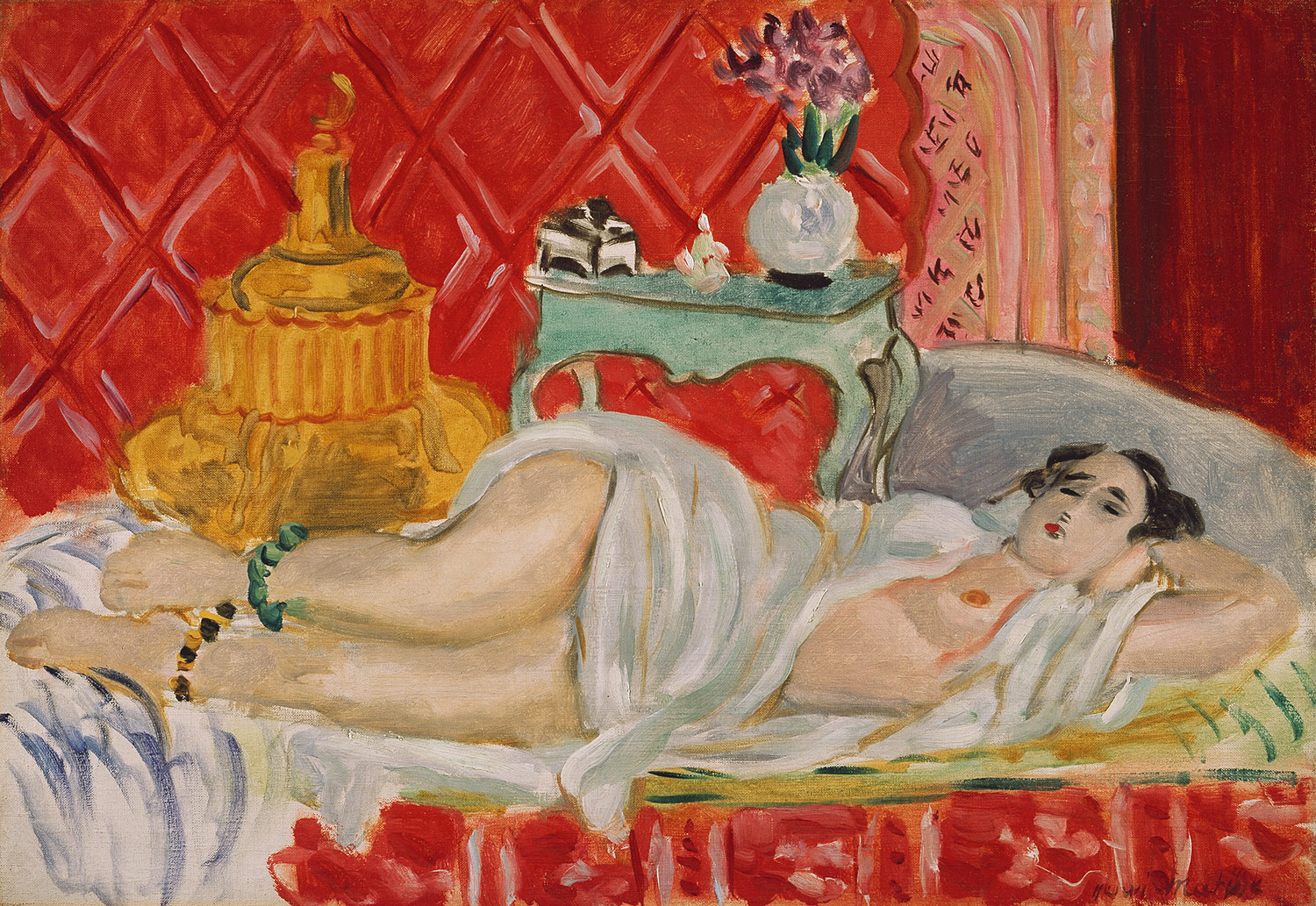

RECLINING ODALISQUE (HARMONY IN RED) - HENRI MATISSE
I like how here Matisse makes the model's skin tones blur almost to the point where you can't tell where one starts and the other begins. The same applies for the pattern in the background of the portrait. It is this sfumato, painting without borders and lines, that I have never been able to reach. It still eludes me, but at least now I know what I have to work on next.

Here are some of my other works from the end of the semester:

SLEEPYTIME
In this one the model almost looks a little too masculine. But I like some of the detailing on the cloth. It's too bad I only see how ridiculous my stool looks from this far away, I could have corrected that.

FINAL LIZARD FACE
I did it again, with the face. This one had come out rather nicely and I didn't want to let it stay unfinished, but I ran out of time to get her face in there. So, I replaced it with another lizard. And I added that sword in there too. Also, the sailboat in the background. So I made a few minor artistic changes.


WHAT ARE YOU DRINKIN
I just like how her face came out in this one. And the Dunkin Donuts cup. A huge iced coffee kind of contrasts with the solemn artistic tones the studio was giving off, I thought it was funny. I'm only noticing now that her right arm is a little too thick around the bicep area.


WILLY'S FACE
This is what Willy's face would look like if it was ridiculously large and sort of in your face. And sort of unfinished. Usually, I try to block in some hair when I draw, but I completely forgot to do his. It almost makes him look like an entirely different person.


File:MonaLisa sfumato.jpeg

Sfumato - One of four styles of painting during the Renaissance, meaning "without lines or borders, in the manner of smoke or beyond the focus plane," which can be seen here in the shading around la Gioconda's eyes.
Detail from "Mona Lisa" by Leonardo da Vinci, 1519.


Pentimento - An alteration in a painting, evidenced by traces of previous work, showing that the artist has changed his mind as to the composition during the process of painting.
Detail from "Salvador Mundi" by Leonardo da Vinci


File:Baglione.jpg
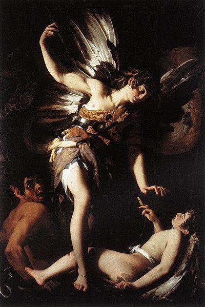
Chiaroscuro - One of four styles of painting during the Renaissance, meaning "light-dark," and indicating clear tonal contrasts which are often used to suggest the volume and modelling of the subjects depicted.
"Sacred and Profane Love" by Giovanni Baglione, 1603 

Contour Line - Bold, dark, dividing lines used by an artist to sketch the boundaries of a form or stress their symmetry.
"Diego" by Alberto Giacometti

Complementary Color Scheme - Colors that are opposite each other on the color wheel are considered to be complementary colors (example: yellow and violet). The high contrast of complementary colors creates a vibrant look especially when used at full saturation.


Painting by John Tubbs


Analogous Color Scheme - Analogous color schemes use colors that are next to each other on the color wheel. They usually match well and create serene and comfortable designs. Analogous color schemes are often found in nature and are harmonious and pleasing to the eye.

Monochromatic - Only using one color, and various shades of that color.
Alexa Meade


Iconography - A particular depiction of a subject in terms of the content of the image, such as the number of figures used, their placing and gestures. For example, here Christ holds existence in his hand, and his right hand reflects a sign that means "peace." Iconology is the study of iconography.
"Salvador Mundi" by Leonardo da Vinci


Foreshortening


"The Lamentation over the Dead Christ" by Andrea Mantegna


Crosshatching - The technique of using intersecting lines and the spaces in between them to depict shadows. Used in pencil drawings and etchings.


"Jeans" by Ashley Castillo


Modernism - A revolt against the conservative values of realism and deism.
"The Gate" by Hans Hofmann


Post Modernism - The critique of the modernist scientific mentality of objectivity and the progress associated with the Enlightenment. It postulates that all apparent realities are only social constructs and thus, subject to change.
"House of Stairs" by M. C. Escher, 1951


Picture Plane - The imaginary flat surface which is usually located between the station point and the object being viewed and is ordinarily a vertical plane perpendicular to the horizontal projection of the line of sight to the object's order of interest.
Brunelleschi's Baptristy


Foreground - The part of a view that is nearest to the observer. The model here is in the foreground.

Midground - The part of a view that is not nearest to the observer nor is it furthest. The table here is in the midground.
Background - The part of a view that is furthest from the observer. The wall here is in the background.
"Reclining Odalisque (Harmony in Red)" by Henri Matisse, 1927.

Friday, November 4, 2011

MODEL 1 - RECLINING
This was one of the first long poses we did. He face came out really odd looking. So did that right leg - I always have trouble with foreshortened things in drawing. I suppose there's really no excuse for that weird foot, though.


MODEL 1 - LEANING
I should probably have done more to put her in the space on this one. I mean, I drew this and I can't even tell you what she's leaning up against. Is that the chair? It might be. I did put a few rugs though, so that must count for something. All in all, this one actually came out quite nice. It's definitely because you can't see her face - that's still a problem area for me.


MODEL 1 - STANDING
I'm sad this one came out so lightly - I need a better camera. Or a huge scanner. Well, now I realize I need to draw much bolder in the future. This one wasn't bad either - except now I realize how fat I made her arm look. The same goes for her stomach, which protrudes in an odd way.


MODEL 1 - NO HEAD
This wasn't a timing issue - I could have had time to do the head instead of going nuts with the desk. The problem was when I framed the drawing, I just didn't leave enough room for the head. Since then, I always start with the top of the head instead of the shoulders - that should have been common sense to me, but what can I say? Anyway, it was kind of a design choice not to give her a head anyway. I knew that before starting the drawing. And it didn't come out half bad!


MODEL 1 - FINAL
This drawing was the last, and I think best, in the batch. Besides the left hand, which strikes me as a little out of wack (I tried a few times with that one, but nothing seemed to work) the picture almost seems proportional. And her face looks like an actual face, almost! That's an enormous leap forward for me.


"Every art expression is rooted fundamentally in the personality and temperament of the artist."

 I thought about this quote from Hoffman when I was posting these next pictures up, about the second model. It is interesting to think of my state of mind when I drew these, and how they turned out as a consequence. Some of the drawings turned out better when I felt more confident about myself. And they all seem to have my dumb sense of humor about them - especially the ones where I turned this poor woman's head into an animal's head. You'll see what I'm talking about soon enough.


MODEL 2 - LIZARD
So I was drawing the second nude model, and I never got around to doing her head. Like, any of it. At all. So she went to take a break, and I decided to pencil in a sort of female version of my other lizard drawing (posted earlier on this same blog). It was kind of a cool experience for me, being able to put my creation on top of a finished full figure and see how the head interacted with the body of a real human being.


MODEL 2 - RECLINING
Again, I fail to put the model really in the space. This especially hurt the drawing since she was so nestled in the chair. The fact that she has no face does not help either. Except this time, I actually kind of liked the ghost version I did as a placeholder, so I didn't have the heart to erase it. This is a terrible habit of mine, and probably makes me a bad artist. Will work on this.


MODEL 2 - NO FACE, PART II
Funny how this kept happening. Other than being faceless, this drawing kind of stayed in proportion. Which was impressive for me, cause her right leg is in a pretty strange position. I should not have kept the ghost face - I would have changed it, but she had to end the pose prematurely.


MODEL 2 - WOLF
You still have no idea what this woman looks like. Her face, at least. So yeah, with those pose, I made her head a wolf thing. I don't really know why. I mean, I'm trying to get better at drawing beast-men. And I don't ever try anything adventurous like beast-women, so this was the closest I came to that.


MODEL 2 - KNIFE ARM
There it is, finally I drew her face. I had no choice, really - she kept this pose for about 45 minutes. Then I made her left arm a knife. It's a little small, though, I really should have made that larger. As a whole, this drawing kind of sucked. Look at her right leg, specifically the knee. Good God, that is horrifying. I think I just did what I always do, again - get caught up in details rather than sketch out the whole outline first.
"THE WIND" HANS HOFFMAN

I really like this painting, and it made me think of a few quotes from Hans Hoffman himself.


"A work of art is a world in itself reflecting senses and emotions of the artist's world."

I think this applies to drawing, painting, and even the art form I love the most - video games. Especially because artists have a tendency to only bring the senses and emotions that they want into their own private world, whether that world is a painting or a virtual world. Of course, in terms of this painting, it makes me wonder what senses and emotions Hoffman was experiencing here. The concept of "the wind" usually brings to mind a calm breeze or some kind of invisible force. Here, the wind takes on a rather violent and confusing pattern, that still remains somewhat geometric and connected.


"What goes on in abstract art is the proclaiming of aesthetic principles... It is in our own time that we have become aware of pure aesthetic considerations. Art never can be imitation."

This quote rings especially true, since Hoffman does not even appear to try to imitate what the wind looks like. Rather, he paints to proclaim the aesthetic beauty of the wind. He is not attempting to literally paint what the wind looks like as it rolls across a landscape, but rather its pure aesthetic considerations.


Friday, October 21, 2011

STILL LIFE - TARP AND LAMP
This was a still life we set up in the corner of the room because Slava, Emily and I are cheaters, and we didn't want to draw the incredibly daring and complex still life our professor set up on the other side of the room. I mean, it was crazy, there was a massive slinky and all these boxes and a DIRT DEVIL. A DIRT DEVIL. Anyway, we drew this. I tried to avoid drawing the massive tarp in the bottom left corner of the page for as long as I could (I hate drawing cloth) but, I couldn't stave it off forever. I mean come on, the thing takes up most of the page. There are some proportion errors here, too - they aren't that obvious now, but if you were looking at the still life you would see areas where I cut corners to make things fit in with the altered geometry I created for my shapes. Actually, I like how the tarp came out. It's probably one of the better drawings I've done of a piece of cloth.

"Treat nature by the cylinder, the sphere, the cone, everything in proper perspective so that each side of an object or a plane is directed towards a central point. (Paul Cezanne)"

I thought about this quote as I did this drawing. I'm not sure if I achieved my goal, but a few of the shapes Cezanne mentioned were actually a part of the still life. The metal portion of the lamp is a cone that does not extend to a point. The cardboard tubes to the right of the page are cylinders. And as I was drawing this, I began to understand how crucial it was to give these shapes direction.

"To paint is not to copy the object slavishly, it is to grasp a harmony among many relationships."

I struggled with this concept as I drew the objects in the corner of the room. Their relationships were what interested me, but I realized that since some of my proportions were off, everything in the drawing became skewed. The relationships between the objects seemed to clash with reality at every turn, because one mistake led to having to cover for that mistake, which caused another error - and so on. However, once I erased over and over again and finally got the drawing right, I was able to correct some of the relationships I had tarnished - in particular, the one between the chair, the rubber tube in the background, and the windowsill it is resting on.

"The contour eludes me."

Indeed it does. And not just with the part with the tarp, as I mentioned. I tried to show the fact that the cardboard tubes were cylindrical (and thus, rounded) and that kind of bombed. It looks worse in person than it does online, so you'll have to take my word for that. But there were a lot of rounded objects in this still life - all the tubes, the lamp shade, and of course the metal parts comprising the chair - and they come across as flat to me even after all the time I spent trying to hatch some kind of texture onto them.
CLASSMATE PORTRAIT - EMILY
This is my friend Emily, who I drew on the first day of drawing class. No, she is not asleep - she was actually drawing someone else and was looking down at her paper. Looking at this drawing a few weeks after the fact, I can see where my facial proportions went awry. Well, a lot of proportions are off, but the hand stands out as oddly small and the nose stands out as oddly large. Sorry about that, Emily! Still, I like this drawing. I'll just have to remember in the future to box everything out before even thinking about details. I like how her hair came out, though - she had it in this bun thing and I was like "well, that's going to be impossible to draw" -  but it came out nicely.

PROFESSOR - INTERIOR
Dear God, where to begin. This is my professor, Judy Rifka, who posed for the us during the second week of drawing class. I like to refer to this drawing as "Rifka Crying Tears of Blood," due to the unnecessarily dark spots I put under her eyes to simulate the shadow emanating from her glasses. The rest of the drawing gets worse from the neck down - her shoulders are too beefy, her arms are enormous, and her legs just came out terribly. Again, I rushed into details before boxing out the proportions of her body. You can't expect to get anything better than this if you don't follow the proper steps. The ONE thing I like about this drawing is her left collar - somehow, even though I suck at crosshatching, that one 3 square inch of page came out very nicely. And it was totally by accident <_<.

BAM
YEAH, that's what's up! This drawing didn't come out half bad. We were supposed to draw our own hands, holding something. I grabbed a paintbrush. Looking at it now a few weeks later, some things become glaringly obvious that were not that way when I was looking at my completed drawing. First of all, the paintbrush is a little on the small side - it was bigger than that. I mean, it's not TINY, but it's off somehow and I can tell the difference. Again, I rushed into detailing the brush itself before making sure it matched up with the hand. Also, my middle and ring finger are wonky. Especially my middle finger - it sucks that I can only see this now, but it's true. Although I do like what I did with the inside joints of my fingers, I wish those two came out better. What can I say? My hand was in a pretty weird position, it looked unnatural to begin with. All in all, this one of my best drawings, though.

Friday, October 7, 2011


HIDEOUT
This was a hideout a designed for a modeling project in my Animation class. The assignment was to make a room. Although I was not proficient enough in Maya to model the room at the time, I think the planning sketch came out nicely. I may model this room for real sometime soon. The theme is some kind of hideout in an urban environment with medieval undertones.

3 POINT PERSPECTIVE
I wanted to try a drawing using three point perspective. You can see the horizontal points on either side of the page (where the glass recedes to) and the other point is higher up, near the top of the page. I added the guy in the motorcycle helmet to give this some kind of movie poster feeling. Will add colors + logo in Photoshop soon.

A BUNCH OF HANDS
I wanted to draw a bunch of hands using this program I found online that will show you a hand in various positions and allow you to move it around in 3D. I spent a lot of time drawing whatever I was looking at in my browser. It felt a little weird drawing an object that I was looking at on the computer, but I have done that a few times since then and I'm getting used to the feeling. The hands came out okay. Also, yeah, that's a nail going through the palm of that bottom hand. I felt like adding some life to each hand individually.

MORE HANDS
So then I drew a hand that I made a claw, a bracer, a hand with some kind of prototype "gun-glove" on it, and a hand with a leather glove on it. Then I tried drawing some more Proximity Cowboy character designs, including one showing his jacket and one showing what he would look like wearing a cowboy hat AND a motorcycle helmet. The answer? He looks like a boss.


MINOTAUR - THINKING
This picture is my vision of a minotaur. Thinking. I'm still exploring the minotaur as a fantasy character, and I'm trying to find my own personal spin on this beast race to make it my own. I need to get used to drawing the form of the minotaur before that comes, however.


MINOTAUR - FULL BODY
I wanted to design the full body of this humanoid after drawing the minotaur thinking. I like how it came out, although I'm really bad at coloring things in on the computer. I will develop this one even further, possibly adding another character in who is seen from the side.